

When someone asks what I do as a user experience designer, here’s what I tell them: I solve problems using interfaces.
As a UX leader, it’s my job to bridge the gap between people and technology through easy, intuitive design. I work closely with Clari’s product, engineering, and design teams to develop solutions purpose-built to serve a diverse range of people—across abilities, backgrounds, and identities.
It’s a great intention, but without the right actions to back it up, inclusive design efforts fall flat.
Harvard Business Review notes that technology tends to reflect the perspectives and experiences of the people who create it. That makes building a diverse team an essential element of any company’s inclusive product design strategy.
Without diversity, teams leave room for unchecked inherent biases that inhibit growth. According to the New York Times, having a more homogenous team means you’re likely missing out on opportunities to innovate, get smarter, and increase revenue.
To build technology that’s truly inclusive, you must deeply understand what your customers want and need by collaborating with a range of potential users. Then you have to figure out the best ways to deliver your product to everyone.
At Clari, it’s our mission to drive revenue operations technology into every business. To do that, our product must first be accessible.
Here are three tips for approaching inclusive and accessible product design, based on how we do it at Clari:
- Start where you are today
- Do your research
- Design in partnership with a broad audience
What’s the difference between inclusive design and accessible design?
First, let’s align on the definitions of inclusive design and accessible design. The two terms are related but not interchangeable. Here’s how the Web Accessibility Initiative defines each:
- Accessible design supports users with specific disabilities, so they can fully engage with the product.
- Inclusive design includes UX and refers to designs used by a wide variety of people. Above all, it’s a design methodology that seeks to support all users, whatever their needs.
Clari’s product design team infuses inclusivity into everything we create. In particular, we begin every project with accessibility at the forefront. Here’s how:
1. Start where you are today
Product design teams don’t have to wait to build more inclusive technology. As the saying goes, perfect is the enemy of good. This holds true for UX teams.
If my team waited to launch a product until everything was absolutely perfect, we wouldn’t have a product in the market. Passivity isn’t the way to make progress. Instead, we approach inclusive design as an ongoing and iterative process that will continually improve over time. You can see this approach in Clari’s technology today.
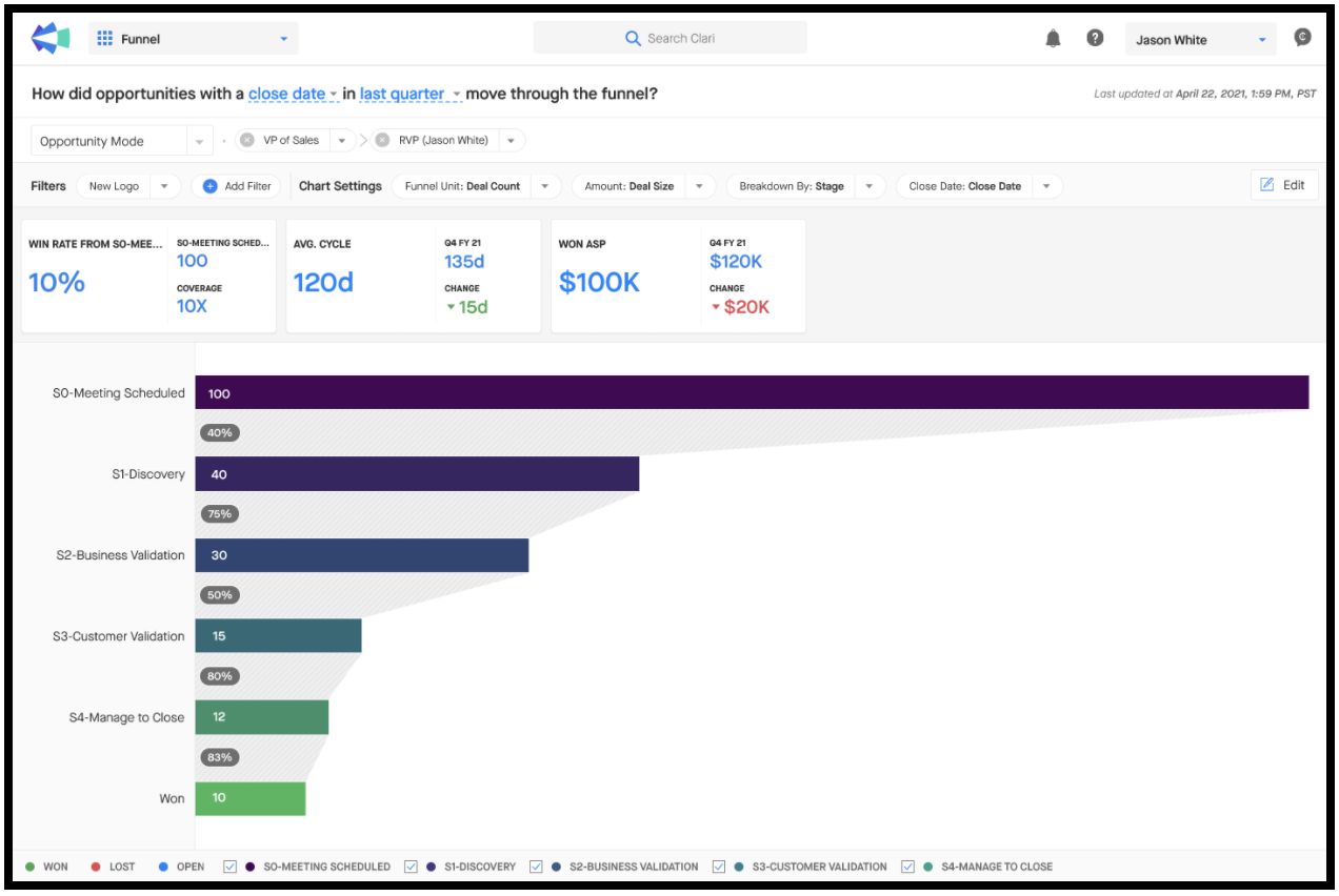
One prime example is the Clari Funnel module, which is a dynamic data visualization showing how deals are moving through the sales funnel, from prospect to net-new customer. As our team designed Clari Funnel, we needed the feature to have a color palette that could accommodate any type of sales motion, regardless of how many sales stages a company had.
Ultimately, the right visuals and colors make it easier for people to digest and share complex information, and it’s one of many ways Clari supports increased revenue efficiency. Plus, this was a much-requested feature from across our customer base, so we had to ensure it was widely accessible.
To make this critical data available at a glance for as many users as possible, our team researched a color-coding system that could illustrate deal progression, while also being visible to anyone, regardless of any visual impairment, such as color blindness, also called color vision deficiency.
The UX team and I evaluated several different color schemes based on different types of color blindness affecting perception of green, red, and blue. After rigorous testing and research, we selected the Viridis color palette, because it was legible to the widest group of people.
This was a welcome design approach for Chris Luebcke, director of platform and data science at Clari, who is partially color blind.
“There's a really broad spectrum of different visual impairments, and Clari’s UX team shows that it’s possible to deliver accessible design that’s also effective, sleek, and beautiful,” says Luebcke. “It’s generally true that accessible design is also just good design.”
Of course, there’s always more work to be done. And there’s always another way to deliver technology to serve even more people. But starting small means we’re making our technology increasingly inclusive over time, one color scheme or design feature at a time.
2. Do your research
UX teams don’t have to reinvent the wheel every time they create or update a product. In fact, starting from scratch can actually put you behind, especially when other organizations already have readily available, proven processes to share.
Startups can learn from the world’s top companies, like Microsoft and Google, which integrate inclusivity throughout their products. These companies and many other groups have published a wealth of existing guidance on inclusive and accessible design, making research a critical part of your UX design strategy.
When my team was designing Clari Funnel’s data visualization, I consulted Microsoft's online manual for inclusive design. We reviewed that manual during a UX design workshop I attended, and I’ve kept it on hand ever since. A key takeaway was a different understanding of disability.
Disability is not only a personal attribute; it’s also context-dependent. In other words, disability is a complex interaction between a person and the society they live in. And, of course, our increasingly digital society relies on technology.
“It's really important to use the kinds of tools and guides that Yunyi and her team leverage,” says Luebcke. “There’s so much variety even within the realm of visual impairments. Delivering a truly accessible design means taking the time to research existing guidance that covers a wide range of different abilities and identities.”
3. Design in partnership with a broad audience
No UX team is designing for an audience of one. After all, designing with just one type of person in mind greatly limits your product’s usability, ultimately hindering your company’s revenue long-term growth.
One of Microsoft’s inclusive design principles that I admire is the concept of solving for one and extending to many. Essentially, that means solving a problem for one marginalized group also has the potential to benefit others, regardless of ability.
For example, adding captions to a video is a relatively light lift effort that can benefit someone who is hard of hearing, as well as someone watching that video on a noisy subway car. Although each person’s scenario is different, they each find value in this update.
In the process of building Clari Funnel, the UX team consulted with our cross-functional teammates to ensure the color scheme worked, regardless of visual ability. Luebcke was one of the people we asked to test the solution.
“As Yunyi and her team were creating Funnel, they understood that what works well for just my specific type of color blindness isn’t enough,” says Luebcke. “They didn’t rely on one viewpoint to create their design. It wasn’t just ‘hey, let me ask my one color blind friend.’ Instead, they maximized accessibility across a wide range of people.”
In UX design, supporting people in the plural is key. This work is fundamentally about designing products for as many people as possible, all while considering their many differences.
“Accessible design is a matter of equity. It certainly requires attention, but at the same time, it’s also not a ton of extra effort or investment,” says Luebcke. “It’s an intentional process change that has the power to ensure better experiences for more users.”
Read more: